Sunday 5 May 2013

Pricing - Industry and market research

To get a sense of the value of my own work, I need to research what is being sold out in the market already and also look at potential printing outlets available to me. High quality digital prints and zines are mediums that really suit my style and i have worked within these mediums on this module.

Zines


This zine being sold at no guts no glory, by Jamie Morrison is being sold for £6, with only 20 editions available and contains over 50 photographs. The black and white style and nature of photography as a medium, I feel that this was a very low input zine to produce, with not much labour intensity. I think the price refects the content and value of the product especially considering the amount the artist would recieve after commission is deducted. The lo-fi non colour style however then benefits with cheap reproduction costs that maximise potential profits and limiting the print run increases value.


Another no guts no glory zine, this time priced at only £4, this collation of pre existing artwork is reflected in the price and also the recycled paper its made with. I am not sure if a cut of the profit has to go to every artist featured or wether they volunteered to have work featured for free as self promotion, but the resources already available cut down labour intensity and produces a product that is still desirable.


Steve Larders zine Rumlad issue 4 sells for only £2.50 at no guts no glory. A surprisingly low cost but i think that is due to the black and white, low production value and the 'issue' nature of it.


This NoBrow press concertina style zine by Kavel Rafferty is being sold for £7.50 but compared to some of the zines above is less, for a higher price, which is interesting.


From the nobrw small press this Thomas Rowe zine, which is hand printed is sold for £50 a pop. This price reflects the high quality and hand made labour of the product. This is a limited edition product with a quality unlike any of the other editions due to the reproductive inconsistency of print which makes each one unique.


Jack Teagles fight comic is sold on nobrow for £7.50 This is a very competetive price for this kind of product, it is affordable for the amount of artwork and jacks style acts as an efficient way of communicating a narrative in a fairly simple style.


Art Prints


This awesome digital painting by the freelance artist and illustrator Nicholas Kay sells for $20 at 12 x 15 and $40 for 18 x 24. This is a super desirable print for someone with my taste and is a price that Would glady pay for the product.The quality of the artwork is high, yet the artist has the digital file and can choose to reproduce any time he wants. This is a great advantage of producing digital artwork but the quality has to be very high to be desirable. I can imagine that this kind of print is only produced on demand, that way no money is wasted as ordering is only available online. To sell at conventions and shops, producing stock in batches then becomes an issue of profit vs production, at least on a more risk taking level.

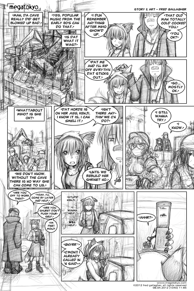
This is an art print for the online webcomic series megatokyo by fred galhager, and is currently on sale for $12.50. It is interesting to compare the price of a digital print such as this to a piece of original art being sold on the same shop.


This original pencil drawing is being sold for $250.00 dollars which shows the kind of value an artist can put on his orginals.
I feel i could only sell original artwork if i had a portfolio overflowing with cool illustrations which wouldn't hurt me too much to lose one or two for the sake of a big profit. However this is something that, working mainly digitally, i cannot really take advantage of. So for me i can consider selling my digital prints at lower costs and maximise profits from a single high quality piece.

Selling work

Looking at where different artists products are sold and the prices they are sold for allows me to see what kind of outlets are available. As an artist i have to decide what kind of outlet is best for my product. Having a company such as NoBrow or No Guts No Glory selling work can help an artist reach audiences in different places but you have to suffer a commission cost. However selling alone requires much hard work from the artist themselves, perhaps utilising free internet space such as blogs to reach potential customers is a good option, promoting on facebook and going out to conventions and paying for a small selling space for a day.

Printing in Plymouth

The art side
Plymouth College of Art
Bretonside Copy
Kenroy and Thompson

These are places I have utilised printing from locally, offering a range of different printing services at varying prices. There are also online places that can be used who will send and post such as ripe digital.
I found that using local printers seems like a more sensible option as proofs advice and discussion with the printer can happen on the spot and postage prices can be avoided.

Free online art forum Deviantart also offers digital printing services for its users to buy and sell artwork to ther users and deviantart handles all the printing and postage services saving the artist alot of work.


Friday 19 April 2013

Stage 2 - Further thematic research


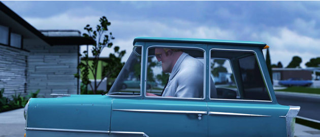
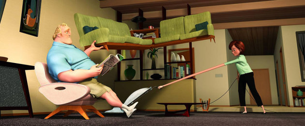
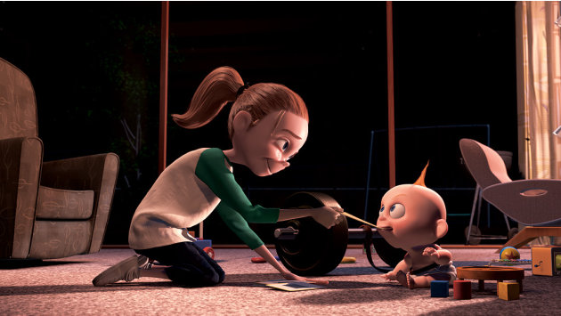
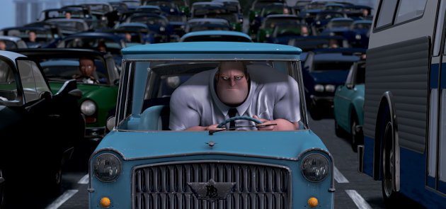
I have been looking at the contrast between the background and character elements in films like the incredibles and how simple and geometric they are as opposed to the characters. I have been thinking about the time scale I have to produce my work and how I need to find a way to speed up the process by simplifying the backgrounds in my comic, and keep the focus on the characters.


This scene from monsters inc is a great take on how something seems scary and changes tone suddenly. This is a good study for how my comics antagonists will be portrayed durign the story. This is also a good look at dark lighting which i have to experiment with in my development.


The trap door is an old claymation series of shorts. For me it is a massive childhood influence and used to scare me and inspire me to make my own plasticine monsters and characters. A similar tone of humour and macarbe is something that i would like to capture in my work. A sense of innocent entertainment with light hearted moral lessons and a interesting style.


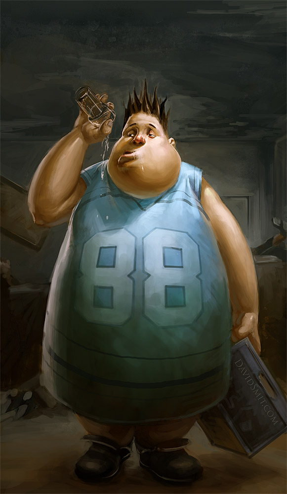
I was browsing david smits blog and found some interesting digital paintings with a nice form and lighting style with good characterisation which is quite inspiring for my project.


Over time i would like to develop a digital style where i am more comfortable with being more rough and expressive and feel like it still looks good.

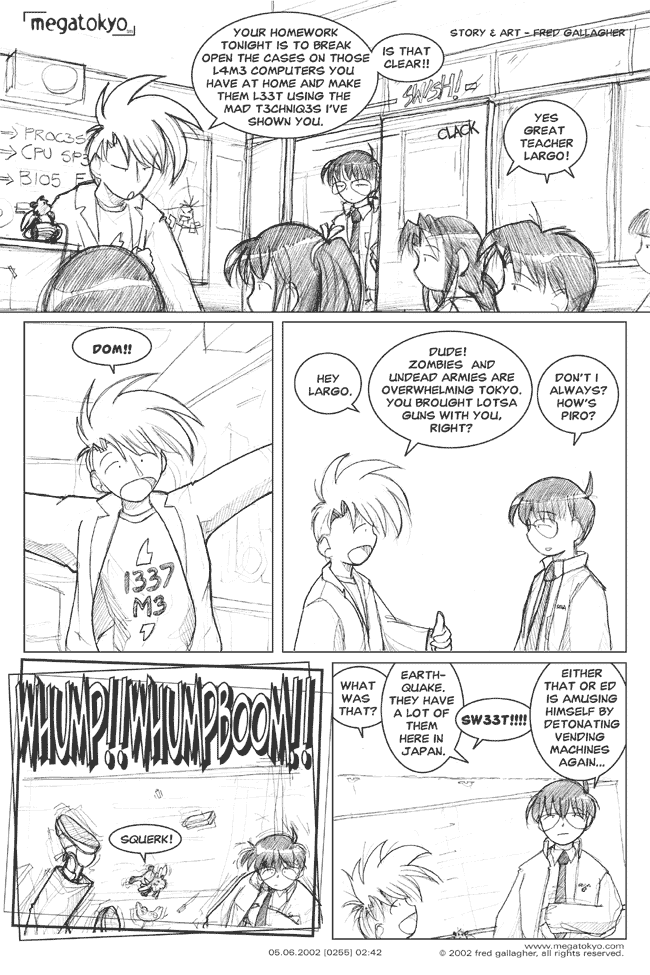
While exploring the web for research I decided to look at a webcomic called megatokyo. It was good research for me as it got me thinking about the backgrounds in my own panels.

Personally, I really dont like anime/manga artwork. I feel that it lends well to comic book styles such as this for its simplicty  efficiency but i hate its lack of originality it also feels out of date. And everyone draws like it. I want my work to be more stylistic and contemporary. However this was good reference material for seeing how the artist, Fred galhager, deals with creating backgrounds. In the top panel he introduces the scene which clearly is given less importance than the characters, but sets the scene and is fairly simple. It then almost entirely dissappears. I feel this is because the background is used at first to tell the viewer where they are but it isn't important, the viewer knows where they are and will remember. Then if their is a change in location you add in a background to tell the viewer the locale has changed. I will consider this in how i can save myself work, but i also know that my short narrative needs a fully finished, laboured quality over it to have value and authenticity which improves its worth and makes people want to own it.


WHAT KIND OF ILLUSTRATIVE PRODUCTS DO I LIKE TO BUY?


It was important to look at the kind of products that interest me and why, to get a sense of what it is that gives products their attractive nature. I have this set of dishonored playing cards, which I own with no intention of using to play. They use differnet symbology for each card to have a unique collectable nature. Using cards like this to play poker, for example, would be confusing, but this is still something I want to own for its style, and unique nature as an ornament. 


As an artist who is inspired by videogames, films and novels, I love to collect artwork and prints related to that. In terms of this, making my own work i have to decide on what kind of niche i want to appeal to, or wether i want to appeal to a broad audience. Not everybody is going to have the same taste as me. With my stage 2 product i want to produce something that has a wide audience with a nuetral kind of theme.


Tuesday 9 April 2013

Stage 2 Initial Research

For my proposed stage 2 project, I decided that playing to my strengths and creating something with a narrative would be the most enjoyable and yield the best results from my style. Here are a few influences that initially inspire my creative process for my zine.

Childrens Animated Films - Disney Pixar, Dreamworks


The stylisation of characters in the animated films by Pixar is something that i would like to capture in my own short narrative. This is a style that appeals to a broad audience by being accessible and understandable. I also find that artwork done in this style comes to life for the viewer, where we are so used to seeing this kind of imagery in motion that our brains can bring it to life by filling in the gaps, especially in a narrative structure.

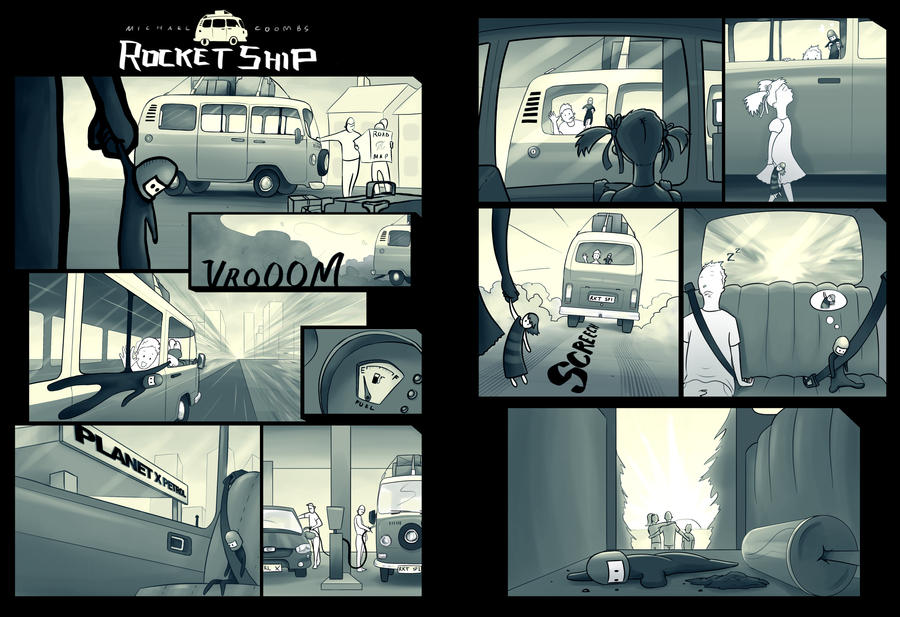
In sequential image making I had a chance to begin to explore this area with my rocket ship spread.


I would like to try and push this further by using a more thoroughly rendered style, without outlines and also trying to capture a similarly strong narrative by minimal use of speech. The Pixar-esque cartoon style would allow me to capitalise on exaggerated proportions and facial expressions to tell the story more easily by use of images alone. 


This short film from Pixar is a very heart warming example of how a powerful story can be told through use of symbols and expressions. Where I am producing work for the kV series brief, it is also a good point of reference for working in black and white.

Rafael Nascimento


A highly rendered cartoon style can be found in the work of Rafael Nascimento. It can be seen in his work how, expression can be exaggerated to create a clear communication of emotion. In his work, a sense of humor is also achieved through the exaggerated feature in his characters. Humor is a very broadly appealing communicator, which many people enjoy and appreciate.


David Smit


This piece by David Smit gives me a lot of ideas of how I would like to explore the theme of everyday objects. In this image the character is given a stronger back story where he has old recyclables as 'armor'. This communicates alot to the viewer without words, it shows his childlike misunderstanding of an alien invasion, his imagination and his sense of misinformed chivalry.


Haunted house imagery

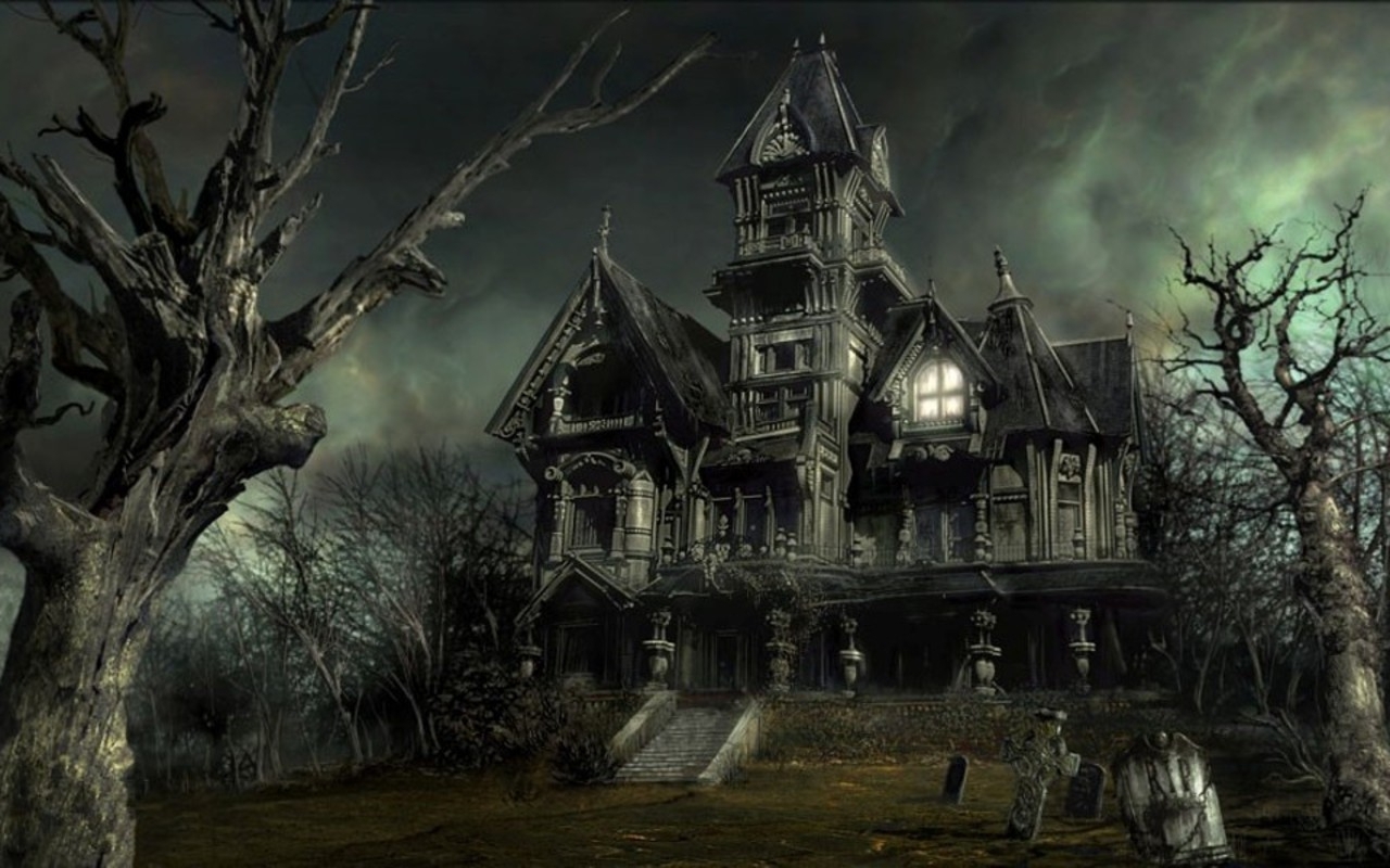
Images collected from google, general thematic haunted house imagery to inform my theme.


These images of haunted houses show just how cliche this theme can be. I want to avoid the horrible, Halloween feel that these create and do something that is more foreboding and mysterious.


Tuesday 2 April 2013

No Guts No Glory


No Guts No Glory is an up and coming independant retail outlet and illustrators networking hub that thrives on the philosophy of supporting emerging talented illustrators in a non profiteering enviornment. We were lucky to be visited by the founders of the shop, Nathan and Haley. 

Their talk was very useful for gaining some insight into the trials and tribulations of starting a business of this kind in a rocky economic climate, and the state of mind and attitude that is required to do it. Nathan had to work very hard, using every available resource and focus hard on what it was he was trying to create, despite being told it would fail. 

What I learnt from this is that everything you want to achieve is possible and all it takes is true passion and dedication to achieve it. The importance of finding freinds and connections with people who are also passionate and willing to help was inspiring and really creates a business that I respect for their values. No Guts No Glory highlights the joys that come from doing what you love and making freinds without the need for money or greed.

Working as an Independant illustrator

Nathan and Haley gave us some information that highlighted some of the aspects that they looked for in artists that they would support in their shop:

-High quality artwork
-Accessible artwork
-Affordable artwork
-Proffessional self presentation
-A passion for what you do
-A freindly approachable and enthusiastic personality

The benefits of working with no guts no glory:

-Exposure, NGNG is becoming more and more well known.
-Make new freinds and meet new artists to inspire and collaborate
-Gain commissions
-Make some money! 
-Do what you love as part of your lifestyle.

Indy artists With No Guts No Glory

Sandra Dieckmann


Sandra dieckmanns work has a beautiful laboured quality to it which gives it value and a perpetuality that makes it worth buying to a wide audience of people who appreciate this kind of work. I need to think about my own work and what qualities make it interesting to buy and what my strengths are to create something of a high quality.


 Sandras work incorporates alot of animals. Working to a theme such as this is obviously a passion of sandras and adds a sense of her concerns and personality to the work. Working in the boundaries of themes that I am interested in also allows me to feel more passionate about my work and in turn would make my work better as a result.

Owen Gent


Owen Gent also produces work for No Guts No Glory whilst also working freelance elsewhere. His artwork has a traditional quality similar to the aesthetic of works by artists such as Van Gogh. This quality gives his prints something that people expect and like to see on the wall in their home, making them more attractive to purchase as decoration. I think that with this niche of appealing to a broad audience through traditional styles whilst also covering modern themes is something new and a good combination of tastes that makes the work accessible. 


Philip Harris


Philip Harris was my favourite artist included in NGNG's collection. His high detail precise style really caught my eye and is somethign that i personally am interested in. I really enjoy imagery that has lots to look at and always has something new to discover. This is what i think adds value to an illustration: A perpetual sense of intrigue. Obviously my tastes differ from the next person and being able to select a niche topic and style that gives artwork a unique style and language that people will want to buy is crucial. 


The indy nature of NGNG and the target audience that they attract, Hipsters and artists, people into the niche scenes and tattoos, can be seen throughout the range of their products which really support the style of artists like Philip Harris.

Monday 4 March 2013

Illustrated Packaging

Samara Andrews

Illustrated packaging is a great way of giving products an added sense of value. For example these packets illustrated by Samara Andrews with texture and healthy colour pallettes, give a home grown 'Touch of Love' feel to the product. This attention to packaging in turn makes the product seem like its worth more and better for you.

Burnt Sugar Packaging - D.Studio

''We then commissioned five illustrators to ‘doodle’ all over the packs so each product had its own individual personality. Not a single font was used on any of the packs – every element was meticulously hand-rendered, including the back of pack statutory information, right down to the recycle logo and ‘e’ sign.''
(Source: http://lovelypackage.com/burnt-sugar/)

These hand illustrated packaging designs allow for a product to gain its own identity and stand out from the sea of items all crying out for your attention. As with the crisp packet designs above, these illustrated bags give a product more valuable and are far more attractive products for people not just looking for a tasty snack, but also looking for some interesting gift fodder. I find this product particularly interesting as even though each product is a different colour with different illustrations, the set feels cohesive and considered. You almost want to buy all the different editions just to have them all.

Andrew Bannecker


These Illustrated drinks bottles are good examples of all the benefits of illustrated packaging, except with this set being in a foreign language, it becomes easier to analyse the imagery in its communication of the product. I find that while visually the designs look very pretty, as someone relying on the imagery, I cannot understand what the illustrations mean, or even what drink is inside. It is safe to say tha each adheres to a different flavour but the illustrations do not communicate as clearly. Looking back at the other packaging I have been researching i realise that this is a common flaw in the illustrated packaging niche. Perhaps this kind of branding only works on a small, indy scale, rather than worldwide corporate design. It does seem that illustrated packaging calls out to consumers who are looking for something more than just what is inside.

Leap Organic Soap - Colorado Studio Moxie Sozo


These beautiful hand illustrated designs on Leap Organics Soap give the product a truly unique and individual style. A sense of authenticity is given to the product which makes it very attractive for potential consumers. I feel the illustrations work better on the box packaging than the soap bottles. I think this is due to the tactile nature of a box as opposed to the plastic, throwaway feel that comes with man made materials. I feel that hand illustrated packaging says 'Sustainability' and 'Eco freindly' which has a rather jarring effect on the plastic bottles.

Friday 1 March 2013

Dans Le Vide


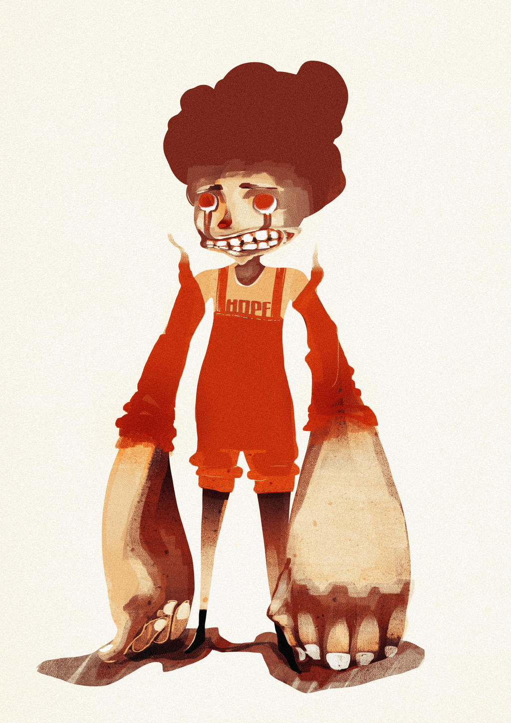
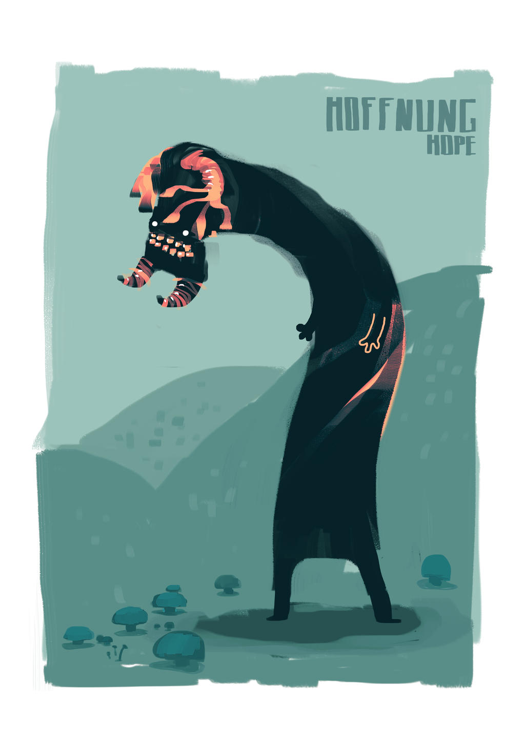
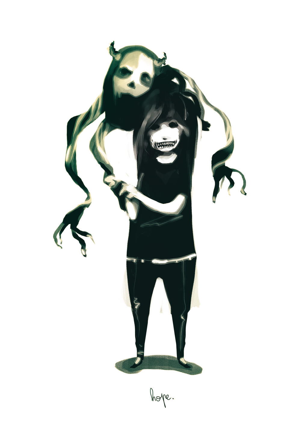
I found this artist on DeviantArt. His work got me thinking how i could use digital software to create imagery that is less render heavy but still pwerful illustration. His one off pieces work well as single illusrations that could sell as limited edition prints and also have a handmade aesthetic despite being digital. I'd like to experiment in photoshop to see if i could create imagery in a similar style: Using more reserved purposeful brushstrokes. The painted edge border design on the 'Hoffnung' piece gives the art a 'one off' feel that would look good in print on high quality paper.


Tom Frost


As the intitial inspiration for this project, Tom frosts work is good for seeing the context that everyday objects can be put into to create indy style limited edition artwork. Toms use of the everyday and colour pallette give his work a warm feeling that invokes nostalgia and authenticity. The combination of old fashioned subject matter with fairly contemporary illustration techniques creates work that function as attractive decor, feeling new and old simultaneously.